


NotanIzer
bigpantsgroup
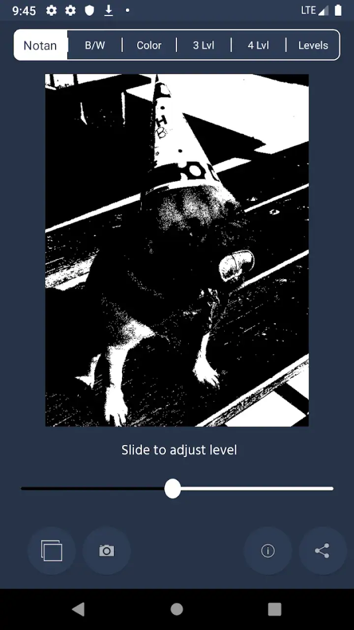
I approached NotanIzer as a small, focused art and design tool rather than a full drawing studio. Its purpose is captured by its unusual name: it helps you work with notan, the visual study of light and dark shapes. That makes it especially interesting for artists, illustrators, photographers, students, and anyone who wants to simplify an image before committing to a more detailed piece.
The app comes from bigpantsgroup and is listed for $1.99, so the decision is fairly straightforward: this is a paid specialist tool, not a free general-purpose sketching app. It is rated for Everyone, works from Android 7.0 onward, and the current version is 1.2.2. With an average rating of 4.3 from around 80 ratings and more than 10,000 installs, it has found a modest but clearly interested audience. I would not choose it because it is popular; I would choose it because its narrow purpose fits a particular part of my creative process.
How NotanIzer fits into an art workflow
Notan is about reducing an image to the relationship between light and dark, often removing distracting color and detail. That sounds simple, but it is one of the quickest ways to test whether a composition has a strong structure. A scene can look attractive because of its colors or texture and still become confusing when reduced to two main values. This kind of app is useful precisely because it encourages me to check that foundation early.
In everyday use, I would place it before drawing, painting, collage work, or graphic design rather than treating it as the final destination. I might look at a reference photo, simplify it, and use the result to decide where the dominant shape should sit. I could also compare several possible compositions before choosing one to develop. That is more practical than spending an hour rendering a scene and only then discovering that the focal point disappears into the background.
The app’s short store description is simply “NotanIzer,” while its broader summary suggests changing the way you work. I think that understated presentation is appropriate. This is not trying to replace a layered illustration program, a photo editor, or a professional design suite. Its appeal comes from making one visual decision easier: seeing whether an image works when detail is stripped away.
Related News

Why WhatsApp Messenger Still Makes Everyday Communication Feel Easy

Jurassic World: The Game Is the Better Dino Tycoon for Strategic Players

Threads in Real Life: Who Should Join, Lurk, or Leave

How SHEIN Turned Shopping Into an Endless Content Feed

How to Make Fortnite Feel Smarter on Mobile

Should You Switch to Microsoft Outlook on Mobile?
A useful test for sketches and reference images
One of the most useful ways I would use it is during the thumbnail stage. Before starting a larger illustration, I can create several rough arrangements and check each one as a light-and-dark pattern. The strongest thumbnail is not always the prettiest one. It is usually the one where the subject remains readable at a glance and the major areas support the intended mood.
This is also valuable for people who work from photographs. A reference may contain too many small objects, uneven lighting, or colors that compete with one another. A notan-style view gives me permission to ignore those distractions. Instead of copying every visible feature, I can concentrate on the silhouette, the balance of masses, and the direction of the eye through the image.
A particularly helpful habit is to inspect the result at a small size. If the central subject disappears when the image is reduced, the composition probably needs work. That is a better test than zooming in and admiring tiny details. NotanIzer is well suited to this kind of quick visual check because the whole point is to make the structure obvious.
Gallery
What the paid price means in practice
At $1.99, the app sits in an inexpensive paid category, but its value depends heavily on how often notan studies fit into your work. Someone who draws regularly and already thinks about composition may get useful mileage from it. A casual user who only wants to apply filters to holiday photos may find the purchase harder to justify, because the app’s strength is not general photo decoration.
I also appreciate that the cost is easy to understand: it is a paid app rather than a free download whose practical value depends on unknown extras. That does not automatically make it a bargain. A low purchase price can still be poor value if the tool does not match your needs. My recommendation would be based on workflow, not on the amount alone.
The important distinction is between access and usefulness. Paying for a focused tool can make sense when it removes a recurring obstacle. If I repeatedly struggle to judge value structure in references, a small dedicated purchase is more appealing than trying to improvise the same check with a larger application every time. If I rarely make visual studies, the same purchase may sit unused.
Where it delivers more than a quick filter
The obvious benefit is simplification, but the deeper benefit is discipline. When I work directly in color, I can become attached to attractive hues before solving the composition. A notan approach reverses that order. It asks whether the picture communicates through shape and contrast first, then leaves color and surface treatment for later.
That makes the app useful for more than traditional drawing. A photographer can use the idea to assess a crop or lighting arrangement. A poster designer can check whether a message has enough visual separation. A student can use it to understand why a master painting remains readable from across a room. Even a person planning a room illustration or a craft project can use a simplified reference to identify the dominant forms.
My favorite practical use would be preparing a small set of studies before beginning a larger piece. I would test the same subject with different placements, remove unnecessary objects from the composition, and choose the version with the clearest hierarchy. This saves materials and attention. It also reduces the temptation to “fix” a weak arrangement with extra detail.
Another non-obvious advantage is that a simplified view can reveal lighting problems that color hides. Warm and cool colors can appear different while having similar visual weight. Once those colors are reduced toward light and dark, the lack of separation becomes easier to notice. That insight can guide later decisions about edges, shadows, and the placement of the focal point.
Limitations I would consider before buying
The narrow focus is both the reason to buy NotanIzer and the main reason to skip it. I would not expect it to serve as a replacement for a full drawing app. If I need layers, detailed brush control, typography, complex selections, or extensive image correction, I would choose a broader tool. A specialist utility can be quicker for one task, but it cannot cover every stage of a finished project.
There is also a creative limitation in relying too heavily on automatic simplification. A two-value result is an aid to judgment, not a final artistic truth. Some images depend on subtle middle tones, transparent color, or delicate edges. If I treated every dark area as one solid shape without thinking, I could lose important information. The useful approach is to study the simplified result and then decide which details deserve to return.
Users who prefer immediate visual effects may find the experience too analytical. This is not the kind of app I would open when I want to make a finished image quickly. Its payoff comes from pausing, comparing, and making compositional choices. That means it rewards patience more than casual experimentation.
The age rating of Everyone makes it approachable for a broad audience, including younger learners working under supervision appropriate to their setting. Still, accessibility in age does not mean the concept is equally useful to everyone. Beginners may need a little practice before they understand why a stark light-and-dark study helps. The app can show a simplified image, but the artistic judgment remains mine.
How I would use it in a normal day
Imagine I have a free evening and want to paint a street scene from a photo taken during a walk. The original image contains signs, windows, parked vehicles, tree branches, and several competing light sources. If I start painting immediately, I may copy the clutter without deciding what the viewer should notice first.
I would use NotanIzer at the planning stage, looking at the image as a compact arrangement of major light and dark areas. If the brightest region pulls attention toward an unimportant corner, I would reconsider the crop or the lighting in my planned painting. If the main figure merges with the background, I would adjust the value relationship before adding color. The result would not be a finished painting, but it would give me a clearer route into one.
For a student, the same process could support a short exercise: choose a reference, make a simplified study, redraw the main shapes by hand, and compare the drawing with the original. The important lesson is not copying the app’s output perfectly. It is learning to identify the few shapes that carry most of the image.
For an experienced artist, I would use it as a decision filter rather than a source of inspiration. It can help reject weak compositions quickly. That is a modest role, but a valuable one when repeated across many projects.
Who is most likely to get real value
I think the strongest audience is made up of people who already sketch, paint, photograph, or design and want a dedicated way to inspect visual structure. It is particularly suitable for artists who often work from references, beginners learning composition, and teachers looking for a simple way to discuss value grouping.
It may also suit anyone who feels that their work becomes busy too quickly. The app encourages a pause before detail. That makes it useful for planning illustrations, choosing poster layouts, or deciding whether a subject will remain clear when viewed from a distance.
I would be more cautious about recommending it to someone who wants a complete mobile art studio. If your priority is painting directly on the screen, editing photographs extensively, or producing polished graphics inside one application, a broader alternative will probably be better. The same is true if you only create art occasionally and do not expect to revisit value studies. In that case, the purchase may not earn its place in your routine.
There is a trade-off between convenience and control here. A dedicated app can make a focused check faster than navigating through a large editor, but a larger editor may offer more ways to refine the result afterward. I would choose NotanIzer when the first need is clarity, not when the first need is production.
My buy-or-skip judgment
I would buy NotanIzer if I were actively learning composition or regularly preparing drawings and paintings from references. The $1.99 price is reasonable for a focused paid tool when it becomes part of a repeatable workflow: test the reference, simplify the value pattern, adjust the composition, and only then begin the detailed work.
I would skip it if I expected a general photo editor, a full illustration package, or a collection of creative effects. Its value is not in the number of things it does. Its value is in making one important question easier to answer: does this image still work when reduced to its main light and dark relationships?
My final opinion is positive but specific. This is a compact art and design app with a clear purpose, a low paid entry price, and enough practical value to justify itself for the right user. I would not recommend it as an essential download for everyone. I would recommend it to a friend who keeps losing the subject in detail or color and wants a simple way to make stronger compositional decisions.
The best reason to use NotanIzer is not to create a final image, but to prevent a weak idea from receiving hours of unnecessary work. Used that way, it can change the order in which you make decisions: structure first, detail later. For artists and designers who benefit from that discipline, this small specialist tool is worth considering.
FAQs for NotanIzer
What is NotanIzer and what does it do?
NotanIzer is a creative image-editing app focused on producing notan-style artwork. It simplifies photos into contrasting light and dark areas, helping you study composition, value distribution, and visual balance. During testing, it was especially useful for artists, students, and photographers who want to turn ordinary images into bold black-and-white references before drawing, painting, or designing.
How do I create a notan image with NotanIzer?
After opening NotanIzer, you typically select an image from your device or capture a new photo, then adjust the threshold that separates lighter and darker areas. Moving this control can dramatically change the result, so experimenting is important. A well-lit, clearly composed photograph usually produces a more recognizable and useful notan study than a dark or cluttered image.
Is NotanIzer suitable for beginners and experienced artists?
Yes. Beginners can use NotanIzer as an accessible introduction to value studies without needing advanced editing knowledge, while experienced artists can use it to quickly test compositions and simplify reference material. The app does not replace artistic judgment, however. You may still need to adjust the source image, crop distractions, or try several threshold settings to achieve the clearest result.
Can I save or share images created in NotanIzer?
NotanIzer is designed to let users keep the results of their image experiments and share them for reference, feedback, or creative projects, depending on the options available in the installed version. Before relying on it for professional work, check the export resolution and supported file formats. Some devices or versions may also place limitations on sharing, storage access, or image quality.
Is NotanIzer free to download, and does it require special permissions?
The availability, pricing, advertisements, and optional purchases for NotanIzer can vary between Android and iOS and may change with updates. The app generally needs access to photos or device storage if you want to import and save images, and camera access may be requested for taking new references. Review the store listing and permission prompts carefully before installing, especially if privacy is a concern.
Pros
- Simple interface makes creating and viewing notes quick.
- Useful for organizing ideas
- reminders
- and short personal records.
- Lightweight design should run smoothly on most Android devices.
- Notes can be edited easily without a steep learning curve.
- Practical for users who prefer a focused note-taking experience.
Cons
- May lack advanced formatting and productivity features.
- Limited collaboration options for sharing notes with others.
- Backup and synchronization features may be less comprehensive.
- The interface could feel basic for users wanting extensive customization.
- Not ideal for managing large projects or complex note collections.


